
 Angular Material


In this post, we are going to go through a complete example of how to build a custom dialog using the Angular Material Dialog component.
We are going to cover many of the most common use cases that revolve around the Angular Material Dialog, such as: common dialog configuration options, passing data into the dialog, receiving data back, and dialog layout options.
This is a step-by-step tutorial, so I invite you to code along as we are going to start with a simple initial scenario. We will then progressively add features one by one and explain everything along the way.
Table of Contents
In this post, we will cover the following topics:
- Declaring a Material Dialog body component
- Creating and opening an Angular Material Dialog
- Angular Material Dialog Configuration Options
- Building the Material Dialog body
- Passing Input Data to the Material Dialog
- Closing The Dialog + Passing Output Data
- Source Code + Github Running Example
Step 1 of 5 - Declaring a Material Dialog body component
In order to use the Angular Material Dialog, we will first need to import MatDialogModule:
Notice also CourseDialogComponent, this component will be the body of our custom dialog.
In order for the component to be usable as a dialog body, we need to declare it as an entryComponent as well, otherwise, we will get the following error while opening the dialog:
Error: No component factory found for CourseDialogComponent. Did you add it to @NgModule.entryComponents?
Step 2 of 5 - Creating and opening an Angular Material Dialog
With this in place, we are now ready to start building our dialog. Let's start by seeing how can we open a dialog from one of our components:
Let's break down this code, to see what is going on here:
- in order to create Material Dialog instances, we are injecting the
MatDialogservice via the constructor - we are then creating an instance of
MatDialogConfig, which will configure the dialog with a set of default behaviors - we are overriding a couple of those default behaviors. for example, we are setting
disableCloseto true, which means that the user will not be able to close the dialog just by clicking outside of it - we are also setting
autoFocusto true, meaning that the focus will be set automatically on the first form field of the dialog
Angular Material Dialog Configuration Options
The class MatDialogConfig allows us to define a lot of configuration options. Besides the two that we have overridden, here are some other commonly used Material Dialog options:
-
hasBackdrop: defines if the dialog should have a shadow backdrop, that blocks the user from clicking on the rest of the UI while the dialog is opened (default is true) -
panelClass: adds a list of custom CSS classes to the Dialog panel -
backdropClass: adds a list of custom CSS classes to the dialog backdrop -
position: defines a starting absolute position for the dialog. For example, this would show the dialog in top left corner of the page, instead of in the center:
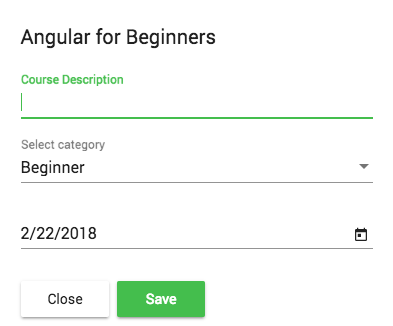
direction: this defines if the elements inside the dialog are right or left justified. The default is left-to-right (ltr), but we can also specify right-to-left (rtl). Here is what a right-to-left dialog looks like:
closeOnNavigation: this property defines if the dialog should automatically close itself when we navigate to another route in our single page application, which defaults to true.
An example of when we would like to set this to false is the Draft Email Dialog of an Email application like Gmail, where the email draft remains opened as we search for ancient emails.
- The
MatDialogConfigalso provides the properties width, height, minWidth, minHeight, maxWidth and maxHeight
Step 3 of 5 - Building the Material Dialog body
Let's now have a look at CourseDialogComponent. This is just a regular Angular component, as it does not have to inherit from any particular class or implement a dialog-specific interface.
The content of this component could also be anything, and there is no need to use any of the auxiliary Angular Material directives. We could build the body of the dialog out of plain HTML and CSS if needed.
But if we want the dialog to have the typical Material Design look and feel, we can build the template using the following directives:
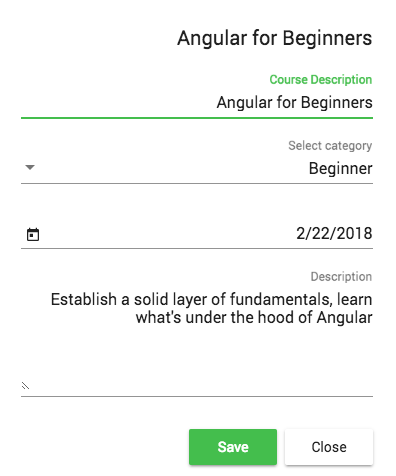
Using these directives, our dialog will look something like this:
Here are the 3 main directives that we used to build this dialog:
-
mat-dialog-title: This identifies the title of the dialog, in this case the "Angular For Beginners" title on top -
mat-dialog-content: this container will contain the body of this dialog, in this case, a reactive form -
mat-dialog-actions: this container will contain the action buttons at the bottom of the dialog
Step 4 of 5 - Passing Input Data to the Material Dialog
Dialogs are often used to edit existing data. We can pass data to the dialog component by using the data property of the dialog configuration object.
Going back to our AppComponent, here is how we can pass some input data to the dialog:
We can then get a reference to this data object in CourseDialogComponent by using the MAT_DIALOG_DATA injectable:
As we can see, the whole data object initially passed as part of the dialog configuration object can now be directly injected into the constructor.
We have also injected something else, a reference to the dialog instance named dialogRef. We will use it to close the dialog and pass output data back to the parent component.
Step 5 of 5 - Closing The Dialog + Passing Output Data
Now that we have an editable form inside a dialog, we need a way to pass the modified (or new) data back to the parent component.
We can do via the close() method. We can call it without any arguments if we simply want to close the dialog:
But we can also pass the modified form data back to AppComponent in the following way:
In the component that created the dialog, we can now receive the dialog data in the following way:
As we can see, the call to dialog.open() returns a dialog reference, which is the same object injected in the constructor of CourseDialogComponent.
We can then use the dialog reference to subscribe to the afterClosed() observable, which will emit a value containing the output data passed to dialogRef.close().
Source Code + Github Running Example
A running example of the complete code is available here on this branch on Github.
I hope that this post helps with getting started with the Angular Material Dialog and that you enjoyed it!
If you would like to learn a lot more about Angular Material, we recommend checking the Angular Material Course, where we cover different types of widgets in much more detail.
If you have some questions or comments please let me know in the comments below and I will get back to you.
To get notified of upcoming posts on Angular Material and other Angular topics, I invite you to subscribe to our newsletter:
If you are just getting started learning Angular, have a look at the Angular for Beginners Course:
Other Angular Material posts:
Angular Material Data Table: A Complete Example (Server Pagination, Filtering, Sorting)